오늘 해본 활용자료
케글에서 kpop그룹에 대한 자료가 있어 가져왔다.
열은 그룹명, 그룹명 줄인임름, 한국이름, 성별, 데뷔일, 소속사, 멤버수, 원래멤버, 팬클럽이름, 활동 으로 이루어 져 있다.
출처: https://www.kaggle.com/datasets/nicolsalayoarias/kpop-groups-dataset?resource=download

열 이름
''' 열이름
Name
Short
Korean Name
Gender
Debut
Company
Members
Orig Memb
Fanclub Name
Active
'''
1. 성별 비율 구하기
#성별 비율
girl_group_df = df[df['Gender']=='Female']
girl_group_cnt = len(girl_group_df)
girl_group_cnt_per = round((girl_group_cnt) / len(df) * 100,2)
boy_group_cnt = len(df) - girl_group_cnt
boy_group_cnt_per = 100 - girl_group_cnt_per
print(f'여자 그룹 수는 {girl_group_cnt}명, 비율은 {girl_group_cnt_per}%')
print(f'남자 그룹 수는 {boy_group_cnt}명, 비율은 {boy_group_cnt_per}%')
→ 여자 걸그룹 수가 조금 더 많았지만 큰 차이는 없었다.
#그래프 그리기
x = np.arange(2)
values = [girl_group_cnt_per, boy_group_cnt_per]
plt.xticks(x, ['girl_group', 'boy_group'])
plt.bar(x, values, color=['tomato', 'deepskyblue'], width=0.4)
for i, v in enumerate(values):
    plt.text(i, v, str(values[i]) + '%', ha = 'center')
plt.show()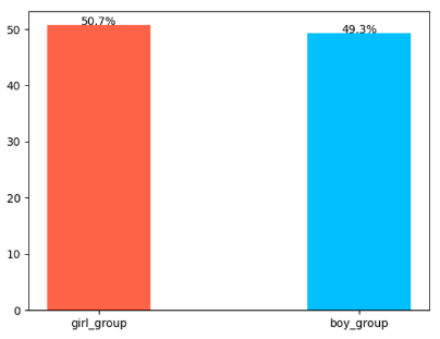
차이는 거의 없다. 완전 프랑스 국기 같다.
2. 회사 비율 구하기
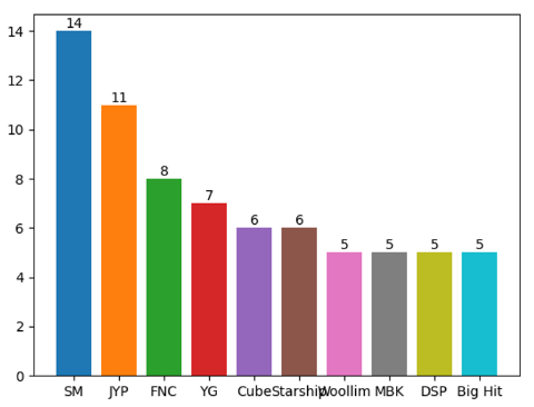
company_df = df['Company'].value_counts().head(10)
print(company_df)

#출력결과
Company
SM          14
JYP         11
FNC          8
YG           7
Cube         6
Starship     6
Woollim      5
MBK          5
DSP          5
Big Hit      5
sm 기획사가 14그룹, > JYP그룹 > FNC 그룹 > YG > Cube > 스타십 > 울림 순이었다.
이를 원 그래프로 그려보겠다.
company_counts = df['Company'].value_counts().head(10)
plt.pie(company_counts, labels=company_counts.index, autopct='%1.1f%%')
plt.axis('equal')
plt.show()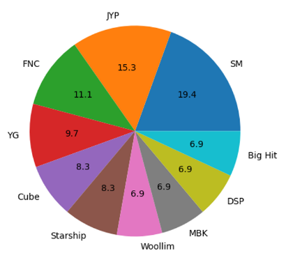
상위 10개만 출력해 보았다.
10개 회사만 봤을 때는 비슷비슷.. sm이 제일 커보임
#회사 비율 구하기
# company_df = df.groupby('Company').size().reset_index(name='counts').sort_values(by='counts', ascending=False)
# print(company_df)
company_df = df['Company'].value_counts()
company_df_top10 = company_df[:10]
company_df_etc = pd.Series(company_df[10:].sum(), index=['etc'])
company_df_new = pd.concat([company_df_top10, company_df_etc])

print(company_df)
plt.pie(company_df_new, labels=company_df_new.index, autopct='%1.1f%%')
plt.axis('equal')
plt.show()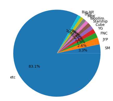
나머지는 기타 취급해서 만들어 봤다. 역시나 스엠이 제일 크다.
이를 막대 그래프로 나타내면 어떨까?
그래프 위에 값을 표시하고 싶었는데 원하는 모양이 나오지 않았다. 이게뭐란말임~~
#막대그래프 그리기
for i in range(10):
    plt.bar(company_df_top10.index[i], company_df_top10[i], company_df_top10[i]) # 라벨이름, 값, 그래프 표시값, 위치
plt.show()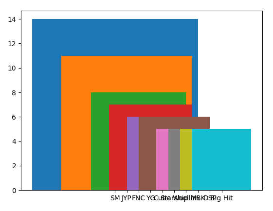
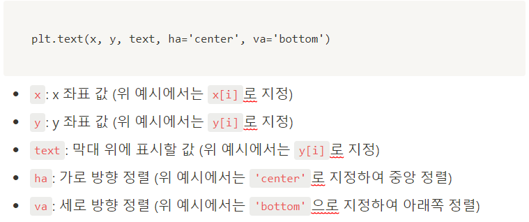
막대 그래프 위에 값을 넣을 때는 plt.text() 함수를 확용해야 한다.
#막대그래프 그리기
for i in range(10):
    plt.bar(company_df_top10.index[i], company_df_top10[i], ) # 라벨이름, 값
    plt.text(i, company_df_top10[i], company_df_top10[i], color='k', ha='center', va='bottom')
plt.show()- plt.bar(label, height)
label은 그래프의 순서, height는 그래프의 값
- plt.text()
matplotlib.pyplot.text(x, y, s, fontdict=None, **kwargs)
pyplot.text(그래프 위에 들어갈 값의 x좌표값, 그래프 위에 들어갈 값의 y좌표값, 그래프값, fontdict(추가하려는 속성값—색, 폰트크기, 폰트모양, 위치—등)
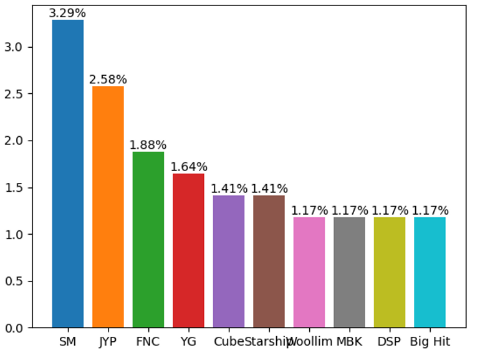
막대그래프로 퍼센트로 나타내 보자.
#막대그래프 그리기(퍼센트)
for i in range(10):
    plt.bar(company_df_top10.index[i], company_df_top10[i]/len(df)*100, ) # 라벨이름, 값
    plt.text(i, company_df_top10[i]/len(df)*100, f'{round(company_df_top10[i] / len(df) * 100, 2)}%', color='k', ha='center', va='bottom')
plt.show()
코드가 살짝 지저분했지만 원하는 값이 나왔다.
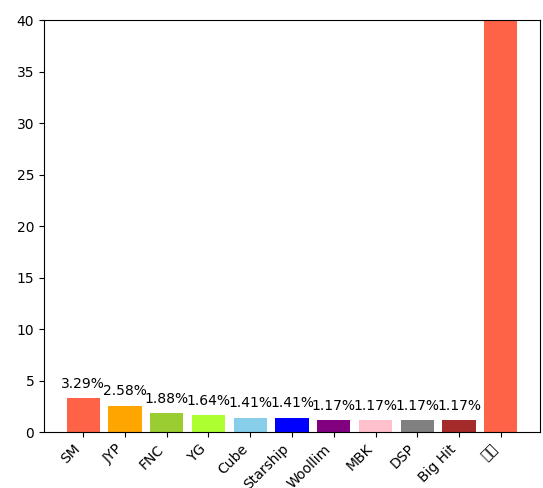
예쁘게 가공해보기
# 회사 비율 그래프 그리기
company_counts = df['Company'].value_counts()
company_counts_top10 = company_counts[:10]
company_counts_etc = pd.Series(company_counts[10:].sum(), index=['기타'])
company_counts_new = pd.concat([company_counts_top10, company_counts_etc])

# 막대그래프 그리기
plt.bar(company_counts_new.index, company_counts_new/len(df)*100, color=['tomato', 'orange', 'yellowgreen', 'greenyellow', 'skyblue', 'blue', 'purple', 'pink', 'gray', 'brown'])
plt.xticks(rotation=45, ha='right')
plt.ylim(0, 40)

# 값 표시하기
for i, v in enumerate(company_counts_new):
    plt.text(i, v/len(df)*100+1, f'{round(v/len(df)*100, 2)}%', color='black', ha='center')

plt.show()
막대 그래프 위에 값을 표시할 때, 값을 그대로 표시하면 그래프와 겹쳐서 보이지 않을 수 있다.
그래서 값을 조금 높게 표시하고자 하는 값 위에 1을 더해주면 값이 그래프 위에 높게 표시된다.
- '기타'로 분류한 회사들을 하나의 그룹으로 만들어 보다 깔끔하게 그래프를 그렸다.
- 회사 이름이 길어서 x축 라벨이 겹치지 않도록 45도 기울여서 표현했다.
- y축 범위는 0~40으로 설정했다.
- 값 표시를 위한 for문에서는 표시하려는 값 위에 1을 더해서 표시했다.
3. 연도별 증가세 확인
girl_group_df = df[df.Gender =='Female']
girl_group_df['Debut_year'] = girl_group_df['Debut'].apply(lambda x: str(x)[-4:])
girl_group_debut_df = girl_group_df.sort_values(by='Debut_year', ascending=False)
girl_group_debut_cnt_df = girl_group_df.groupby('Debut_year')['Name'].count()

print(girl_group_debut_cnt_df)
출력결과
#출력결과
Debut_year
1997     2
2001     1
2002     1
2005     2
2006     1
2007     4
2008     1
2009     7
2010     4
2011    10
2012    13
2013     6
2014    13
2015    12
2016    17
2017    23
2018    24
2019    18
2020    20
2021    14
2022    17
2023     4
nan      2
Name: Name, dtype: int64
#연도별 데뷔 걸그룹 수 구하기
girl_group_df = df[df.Gender =='Female']
girl_group_df['Debut_year'] = girl_group_df['Debut'].apply(lambda x: str(x)[-4:])
girl_group_debut_df = girl_group_df.sort_values(by='Debut_year', ascending=False)
girl_group_debut_cnt_df = girl_group_df.groupby('Debut_year')['Name'].count()
print(girl_group_debut_cnt_df)
#그래프 그리기
plt.plot(girl_group_debut_cnt_df.index, girl_group_debut_cnt_df.values, marker='o', color='tomato')
plt.title('걸그룹 연도별 데뷔 수')
plt.xlabel('연도')
plt.ylabel('데뷔 수')
plt.show()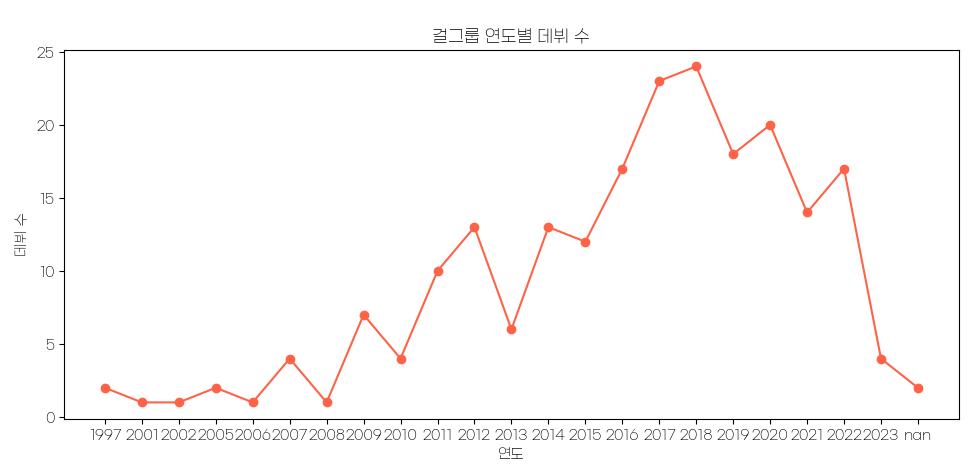
2016년부터 2018년까지 아이돌 수가 급증했다.
내 추측으로는.. 2016년부터 2018년까지 유행한 프로듀스101 , 48 등 서바이벌 프로그램의 유행으로 아이돌 데뷔에 대한 관심이 현저히 늘면서 소속사에서도 데뷔에 박차를 가한 것 아닐까… 궁예해본다.
막대바로도 표시해 봤다.
#그래프 그리기
plt.bar(girl_group_debut_cnt_df.index, girl_group_debut_cnt_df.values, color='coral')
for idx, value in enumerate(girl_group_debut_cnt_df):
    plt.text(idx, value+0.2, value, color ='k', ha='center')
plt.title('걸그룹 연도별 데뷔 수')
plt.xlabel('연도')
plt.ylabel('데뷔 수')
plt.show()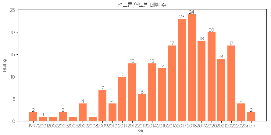
→ 오히려 2023년에는 걸그룹이 많이 데뷔하지 않았다.
+a 보이그룹과 비교해서 출력해 보자.
3.1. 누적 그래프 그리기
참고링크: https://matplotlib.org/stable/api/_as_gen/matplotlib.pyplot.stackplot.html
#전체 데이터에서 데뷔 년도 추가
df['Debut_year'] = df['Debut'].apply(lambda x: str(x)[-4:])
girl_group_df = df[df.Gender =='Female'] #걸그룹
girl_group_debut_cnt_df = girl_group_df.groupby('Debut_year')['Name'].count()
boy_group_df = df[df.Gender =='male'] #보이그룹
boy_group_debut_cnt_df = boy_group_df.groupby('Debut_year')['Name'].count()

#누적 그래프 그리기
plt.bar(girl_group_debut_cnt_df.index, girl_group_debut_cnt_df.values, color='coral')
plt.bar(boy_group_debut_cnt_df.index, boy_group_debut_cnt_df.values, color='conflowerblue', bottom=girl_group_debut_cnt_df)
plt.show()
#전체 데이터에서 데뷔 년도 추가
df['Debut_year'] = df['Debut'].apply(lambda x: str(x)[-4:])
girl_group_df = df[df.Gender =='Female'] #걸그룹
girl_group_debut_cnt_df = girl_group_df.groupby('Debut_year')['Name'].count()
boy_group_df = df[df.Gender =='male'] #보이그룹
boy_group_debut_cnt_df = boy_group_df.groupby('Debut_year')['Name'].count()
#누적 그래프 그리기
plt.bar(girl_group_debut_cnt_df.index, girl_group_debut_cnt_df.values, color='coral')
plt.bar(boy_group_debut_cnt_df.index, boy_group_debut_cnt_df.values, color='cornflowerblue', bottom=girl_group_debut_cnt_df.values)
plt.show()
ValueError: shape mismatch: objects cannot be broadcast to a single shape. Mismatch is between arg 0 with shape (0,) and arg 3 with shape (23,). 오류가 남
-> 오류는 x축과 y축의 길이가 일치하지 않아서 발생한 것이다.
코드
#전체 데이터에서 데뷔 년도 추가
df['Debut_year'] = df['Debut'].apply(lambda x: str(x)[-4:])
girl_group_df = df[df.Gender =='Female'] #걸그룹
boy_group_df = df[df.Gender =='Male'] #보이그룹

girl_group_debut_cnt_df = girl_group_df.groupby('Debut_year')['Name'].count() #각각 연도별로 정렬
boy_group_debut_cnt_df = boy_group_df.groupby('Debut_year')['Name'].count()

# 없는 년도가 있으니 추가해주기
for i, v in girl_group_debut_cnt_df.items():
    if i not in boy_group_debut_cnt_df.keys():
        boy_group_debut_cnt_df[i] = 0
for i, v in boy_group_debut_cnt_df.items():
    if i not in girl_group_debut_cnt_df.keys():
        girl_group_debut_cnt_df[i] = 0

#정렬
girl_group_debut_cnt_df = girl_group_debut_cnt_df.sort_index()
boy_group_debut_cnt_df = boy_group_debut_cnt_df.sort_index()
print(girl_group_debut_cnt_df, boy_group_debut_cnt_df)


#누적 그래프 그리기
plt.bar(girl_group_debut_cnt_df.index, girl_group_debut_cnt_df.values, color='coral', label='걸그룹')
plt.bar(boy_group_debut_cnt_df.index, boy_group_debut_cnt_df.values, color='cornflowerblue', bottom=girl_group_debut_cnt_df.values, label='보이그룹')
plt.legend()

#값 표시하기
for i, v in enumerate(girl_group_debut_cnt_df):
    if v != 0:
        plt.text(i, v, str(v), ha='center')
for i, v in enumerate(boy_group_debut_cnt_df):
    if v != 0:
        plt.text(i, girl_group_debut_cnt_df.values[i]+v, str(v), ha='center')

#그래프 띄우기
plt.show()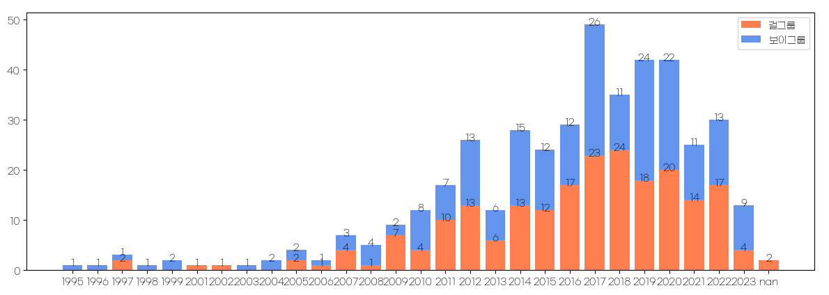
위 코드에 plt.text() 함수를 적용하여 각 막대 그래프 위에 값을 표시할 수 있다.
- plt.text(x, y, text, ha)에서 x와 y는 각각 표시하고자 하는 값의 x, y 좌표를 의미한다.
- text는 표시하고자 하는 값을 입력하면 된다.
- ha는 가로 방향 정렬 방법을 의미한다.
- center로 설정하면 가운데 정렬이 된다.
- 막대 그래프 위에 값을 표시할 때, 값이 그래프와 겹치지 않도록 하기 위해서는 y 좌표에 일정 값을 더해주면 된다.
위 코드에서는 걸그룹과 보이그룹 각각 for문을 사용하여 값을 표시했다.
4. 그룹별 멤버수 통계내기
# 몇명의 그룹이 가장 많을까?
ordered_group_df = df.groupby('Members')['Name'].count() #멤버별로 정렬, 이름 수 세기

# 막대그래프로 그려주기
plt.title('그룹별 멤버수')
plt.bar(ordered_group_df.index, ordered_group_df.values, color='limegreen') #라임그림 색으로
# x, y 라벨에 범례명 넣기
plt.xlabel('멤버수')
plt.ylabel('그룹수')

# 표에 값 넣어주기
for i, v in ordered_group_df.items():
    plt.text(i, v+1, str(v), ha='center')

# x축에 1씩 표시하기
plt.xticks([x for x in range(1, max(ordered_group_df.index)+1)])
plt.axis('tight')
plt.show()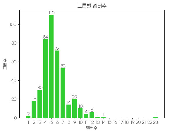
→ 5명의 그룹이 가장 많았다.
→ 4명 ~ 7명의 그룹이 가장 많았다. 5명이 가장 많은 것 보니까 5명이 가장 동선균형이 높나보다..
활동중인 그룹 찾기
활동중인 그룹 중 데뷔가 가장 오래된 그룹들을 출력해 보자
- 그리고 그 그룹들의 성별도 알아보고 소속사도 조회해 보고
- 소속사의 영향이 있는지 확인해 본다.
일단 활동중이고, 데뷔 오래된 순으로 50개 그룹을 정렬한 후 그 데이터를 바탕으로 데이터를 가공해 보겠슴다.
# 활동중인 그룹 그룹
df['Debut_year'] = df['Debut'].apply(lambda x: str(x)[-4:])
active_group = df[df['Active'] == 'Yes']
active_group_debut_df = active_group.sort_values(by = 'Debut_year', ascending=True).head(50)
print(active_group_debut_df[['Name', 'Debut_year', 'Company', 'Gender']])
출력결과
Name Debut_year            Company  Gender
323          SECHSKIES       1997            DSP| YG    Male
332            Shinhwa       1998  SM| Good| Shinhwa    Male
152             g.o.d.       1999       JYP| SidusHQ    Male
148     Fly to the Sky       1999             SM| H2    Male
163       Girls' World       2002                Liz  Female
378              TVXQ!       2003                 SM    Male
329         SG Wannabe       2004                B2M    Male
349       Super Junior       2005                 SM    Male
153            Gavy NJ       2005        Good Fellas  Female
85    Brown Eyed Girls       2006             Mystic  Female
60             BIGBANG       2006                 YG    Male
352          Supernova       2007             CJ E&M    Male
161  Girls' Generation       2007                 SM  Female
150           FTISLAND       2007                FNC    Male
218               KARA       2007                DSP  Female
119            Davichi       2008             CJ E&M  Female
331             SHINee       2008                 SM    Male
10                 2PM       2008                JYP    Male
382             U-KISS       2008           NH Media    Male
251              MBLAQ       2009            J. Tune    Male
185          Highlight       2009          Around Us    Male
217                JYJ       2010              C-JeS    Male
106             CNBLUE       2010                FNC    Male
356           Teen Top       2010          TOP Media    Male
51                B1A4       2010                 WM    Male
203           Infinite       2010            Woollim    Male
36               Apink       2011             Plan A  Female
269             MYNAME       2011                 H2    Male
84         Brave Girls       2011              Brave  Female
75             Block B       2011                 KQ    Male
112         CROSS GENE       2012              Amuse    Male
34                 AOA       2012                FNC  Female
263              MR.MR       2012          WinningIn    Male
140                EXO       2012                 SM    Male
86                BtoB       2012               Cube    Male
6                  24K       2012             Choeun    Male
396               VIXX       2012          Jellyfish    Male
284             NU'EST       2012             Pledis    Male
1                 100%       2012          TOP Media    Male
32            AlphaBat       2013            Simtong    Male
87                 BTS       2013            Big Hit    Male
246            Mamamoo       2014                RBW  Female
411             WINNER       2014                 YG    Male
226             Laboum       2014                 NH  Female
61              Bigflo       2014                 HO    Male
178               HALO       2014             Histar    Male
311         Red Velvet       2014                 SM  Female
262           MONSTA X       2014           Starship    Male
49               B.I.G       2014                 GH    Male
236             LU:KUS       2014                JWK    Male

종료 코드 0(으)로 완료된 프로세스
성별차이
막대 그래프 그리기
# 활동중인 그룹 그룹
df['Debut_year'] = df['Debut'].apply(lambda x: str(x)[-4:])
active_group = df[df['Active'] == 'Yes']
active_group_debut_df = active_group.sort_values(by = 'Debut_year', ascending=True).head(50)
# print(active_group_debut_df[['Name', 'Debut_year', 'Company', 'Gender']])

male_cnt = len(active_group_debut_df[active_group_debut_df['Gender']=='Male'])
female_cnt = len(active_group_debut_df) - male_cnt
# print(male_cnt, len(active_group_debut_df)-male_cnt)
x = np.arange(2) #x는 [0 1]

colors=['plum', 'pink'] #색 지정
labels=['male', 'female'] #x값 라벨 지정
values = [male_cnt, female_cnt] #y값 라벨 지정
plt.bar(x, values, color=colors, width=0.5)
for i in range(len(labels)):
    plt.text(x[i], values[i]-2, values[i], ha='center', fontsize=16)
plt.xticks(x, labels)

plt.show()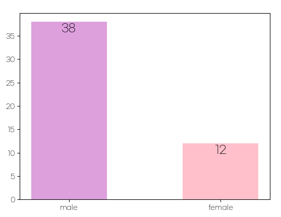
아래는 matplotlib의 plot 객체를 사용하여 막대 그래프에 values 값을 지정하는 예시이다.
import matplotlib.pyplot as plt

# 데이터
x = ['A', 'B', 'C', 'D']
y = [10, 20, 30, 40]

# 막대 그래프 그리기
plt.bar(x, y)

# 각 막대 위에 값 표시하기
for i in range(len(x)):
    plt.text(x[i], y[i], y[i], ha='center', va='bottom')

# 그래프 출력하기
plt.show()
원 그래프 그리기
# 활동중인 그룹 그룹
df['Debut_year'] = df['Debut'].apply(lambda x: str(x)[-4:])
active_group = df[df['Active'] == 'Yes']
active_group_debut_df = active_group.sort_values(by = 'Debut_year', ascending=True).head(50)
# print(active_group_debut_df[['Name', 'Debut_year', 'Company', 'Gender']])

male_cnt = len(active_group_debut_df[active_group_debut_df['Gender']=='Male'])
print(male_cnt, len(active_group_debut_df)-male_cnt)
colors=['plum', 'pink']
labels=['male', 'female']
explode = [0, 0.10]
plt.pie([male_cnt, len(active_group_debut_df)-male_cnt],
        labels = labels, explode=explode,
        autopct='%1.1f%%', colors=colors)
plt.title('K-POP 오래된 그룹 성별비율')
plt.show()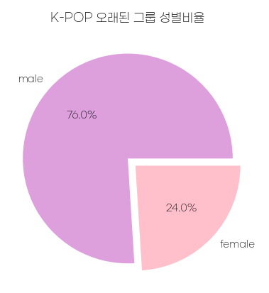
지금보니 오래된이 아니라 연차 높은 그룹이라고 할 걸 그랬다..
5. 회사에 따른 차이가 있는지 알아보기
# 활동중인 그룹 그룹
df['Debut_year'] = df['Debut'].apply(lambda x: str(x)[-4:])
active_group = df[df['Active'] == 'Yes']
active_group_debut_df = active_group.sort_values(by = 'Debut_year', ascending=True).head(50)
# 활동중인 그룹 그룹
df['Debut_year'] = df['Debut'].apply(lambda x: str(x)[-4:])
active_group = df[df['Active'] == 'Yes']
active_group_debut_df = active_group.sort_values(by = 'Debut_year', ascending=True).head(50)
#회사별 수 구하기
company_cnt = active_group_debut_df['Company'].value_counts()
ax = company_cnt.plot(kind='barh', figsize=(10, 9), color='cornflowerblue') # figsize(가로길이, 세로길이)
ax.set_xlabel('활동그룹 연차 TOP50 소속사별', fontsize=15)
ax.set_ylabel('Company', fontsize=10)
ax.tick_params(axis='both', labelsize=12)
for i in ax.containers:
ax.bar_label(i, label_type='edge', fontsize=10, padding=5)
plt.show()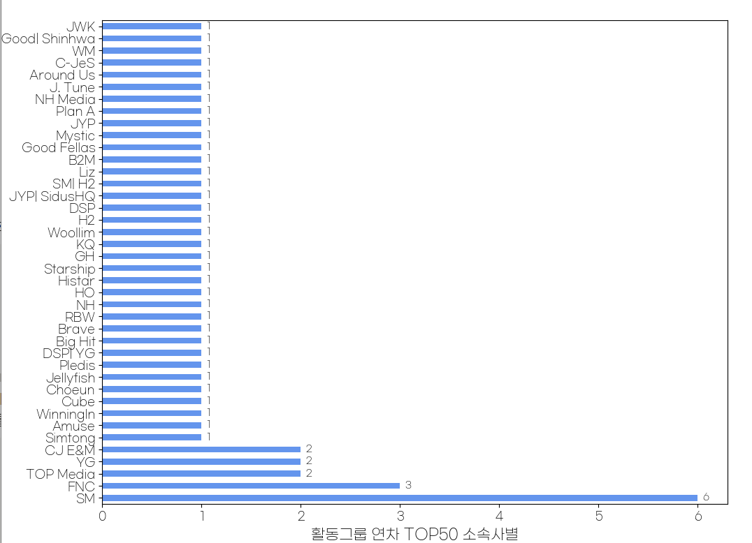
SM 그룹 소속된 아이돌이 가장 오래가는 경향이 있다.
이를 원그래프로 만들어보자.
# 활동중인 그룹 그룹
df['Debut_year'] = df['Debut'].apply(lambda x: str(x)[-4:])
active_group = df[df['Active'] == 'Yes']
active_group_debut_df = active_group.sort_values(by = 'Debut_year', ascending=True).head(50)

#회사별 수 구하기
company_cnt = active_group_debut_df['Company'].value_counts()
company_top5 = company_cnt[:5]
company_etc = pd.Series(company_cnt[5:].sum(), index=['etc'])
company_cnt_new = pd.concat([company_top5, company_etc])

print(company_cnt_new)
plt.pie(company_cnt_new, labels=company_cnt_new.index, autopct='%1.1f%%')
plt.axis('equal')
plt.show()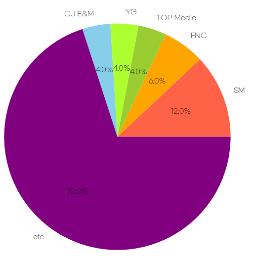
결론: 여전히 sm은 건재했다.
400개의 아이돌 그룹에 대해 matplotlib을 가지고 데이터 활용을 해 봤다.
아주 재밌었다. 역시 꾸미니까 할맛이 나는 기분이었다.
아직 위키독스 수평선/수직선 그리기 까지 공부를 하지 않아서 주말에 1회독 + 복습이 목표!~!!
'개발공부 > Python' 카테고리의 다른 글
| [Matplotlib] 그래프에 옵션 추가 - title(), legend(), color(), marker(), linestyle() (0) | 2023.06.23 |
|---|---|
| [Python] List Comprehension(리스트 컴프리헨션) 공부와 Nato 알파벳 음성기호 만들기 (0) | 2023.06.10 |
| [Matplotlib] Matplotlib에서 한글 깨짐 문제 해결하기 (0) | 2023.06.08 |
| [Matplotlib] 1. Matplotlib 기본 사용 (0) | 2023.06.07 |
| [Matplotlib] 0. Matplotlib 설치하기 (0) | 2023.06.07 |